Toymania / Mobile App · 2021
From discovery to checkout.
A native iOS and Android app for one of Brazil's largest toy retailers, designed from scratch on top of their VTEX store.
UX/UI Designer, Wicomm · iOS and Android, on VTEX
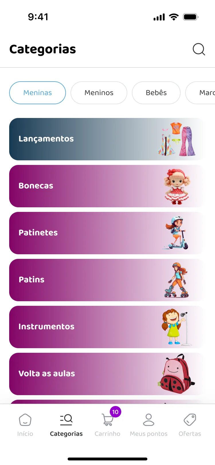
Finding a toy starts with who it is for.
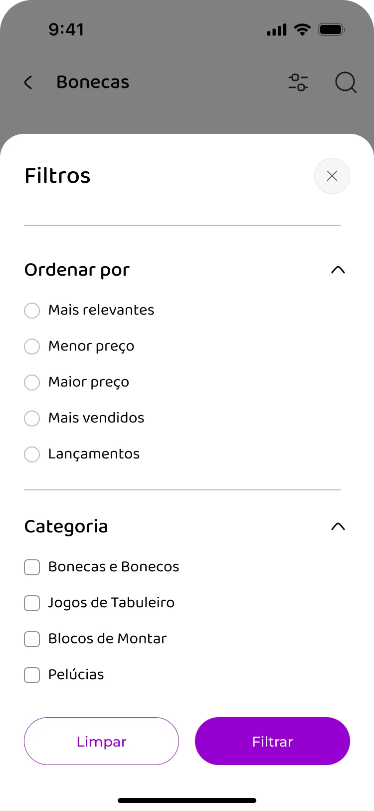
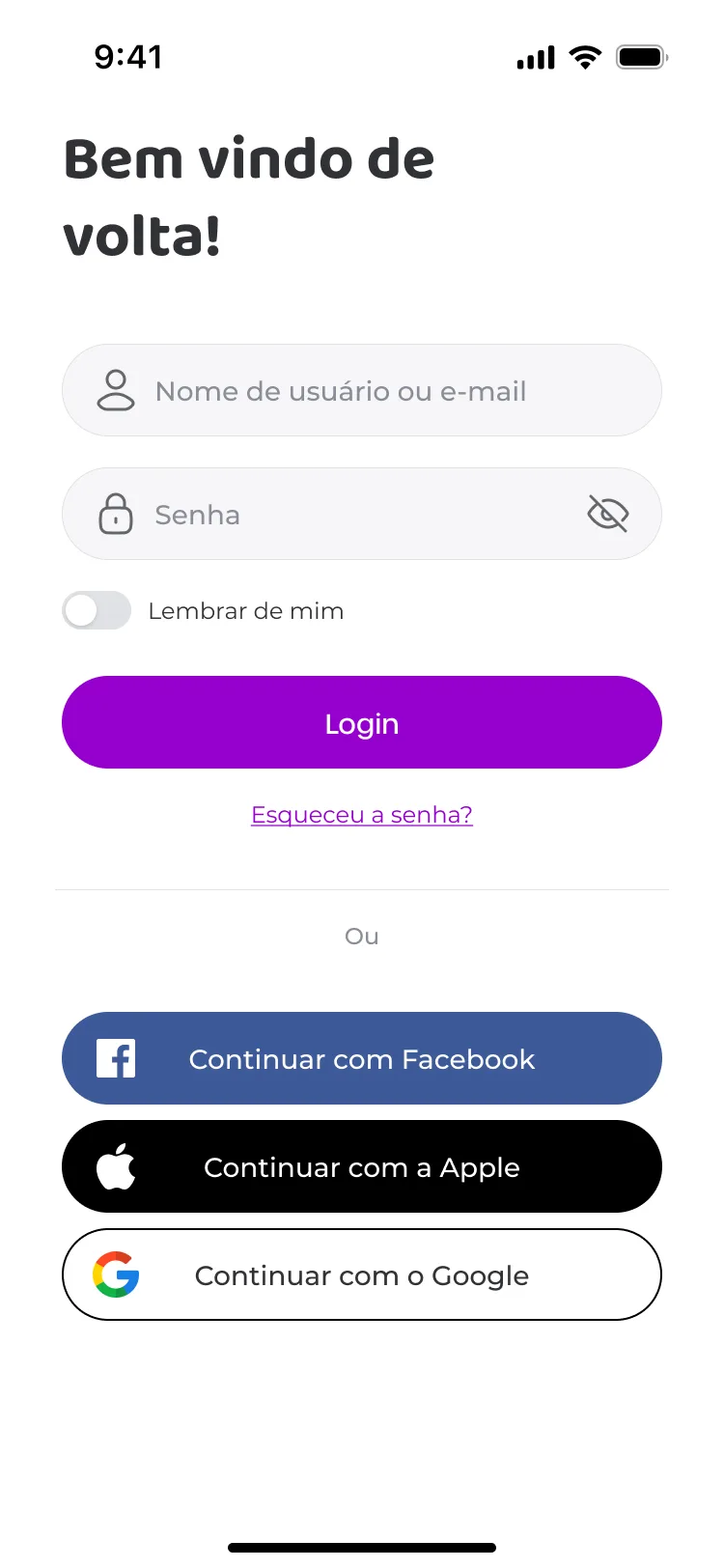
The whole app: sign in, category browsing, filters, the product page, the cart, and checkout. Toymania sells to parents buying for a specific child, so categories lead with who the toy is for and the filters carry that through the catalogue.
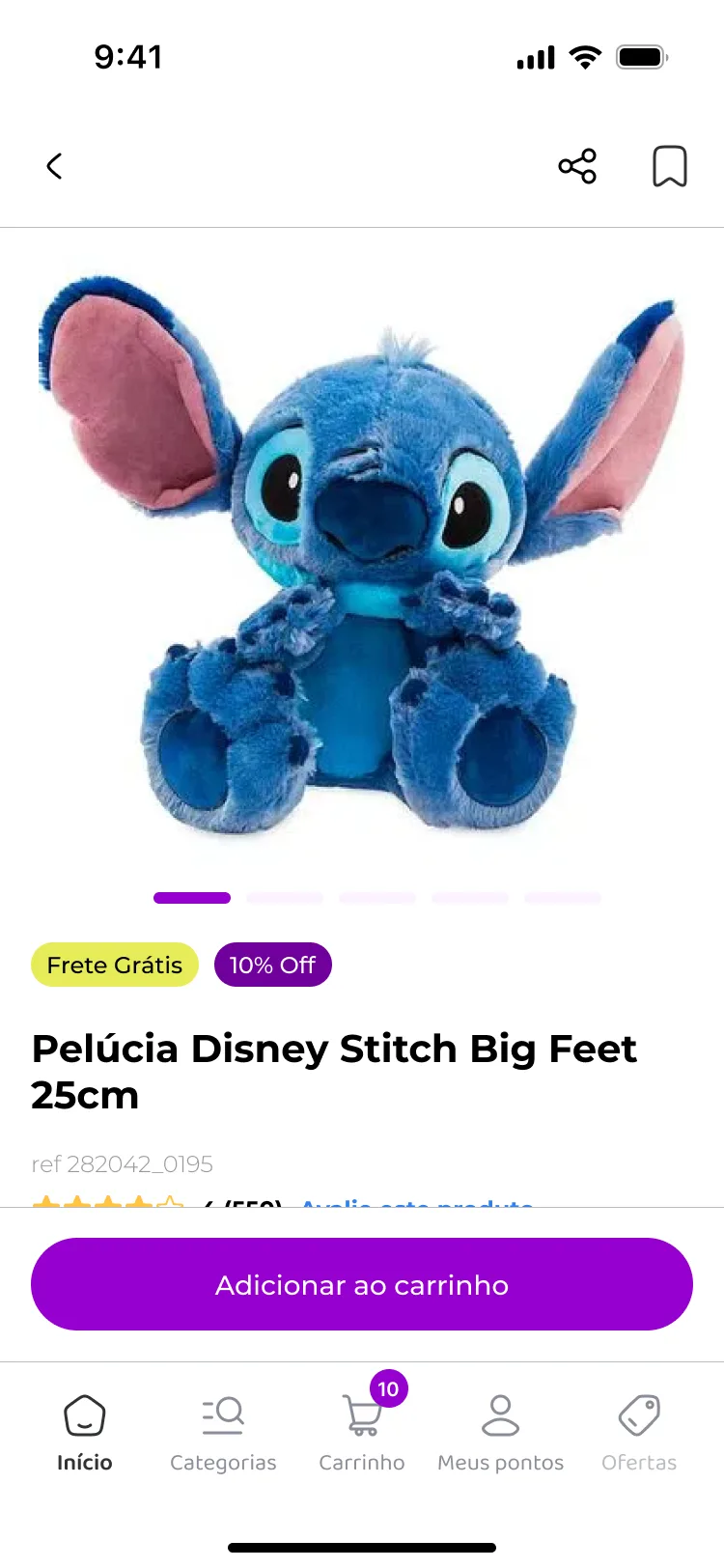
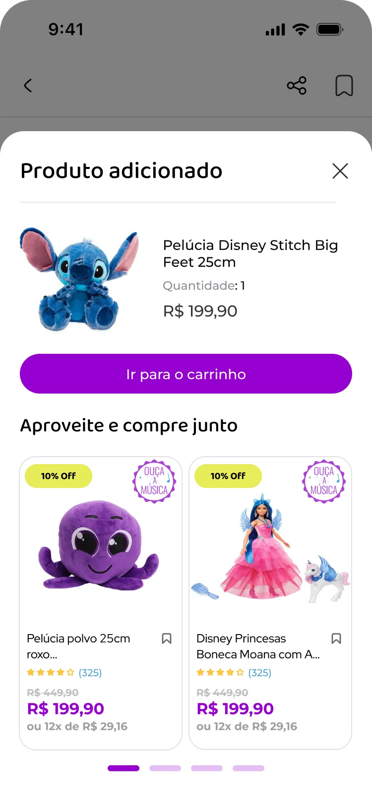
From product to purchase.
The product page, add-to-cart confirmation, cart, and checkout form the purchase sequence I designed for the app.
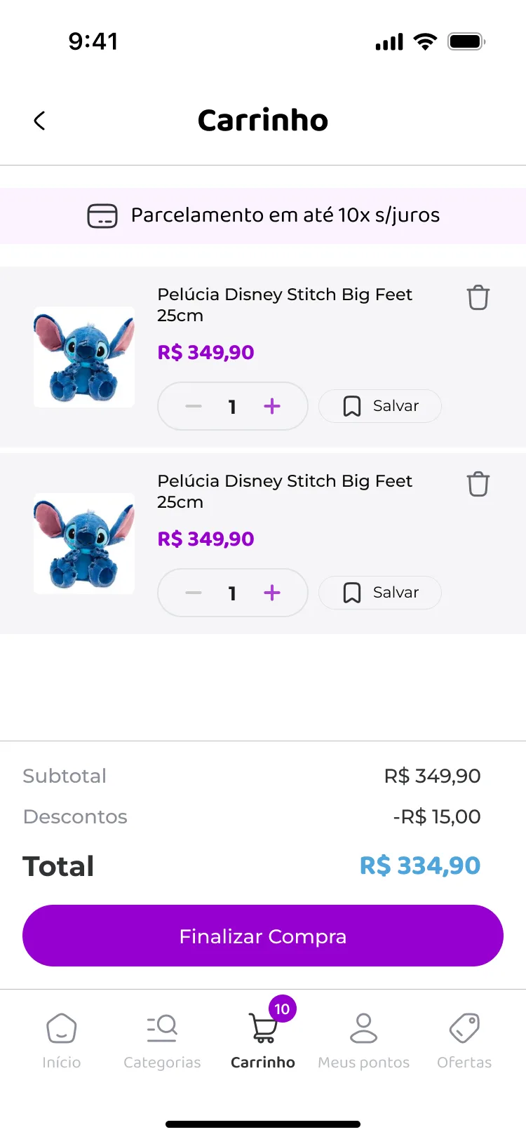
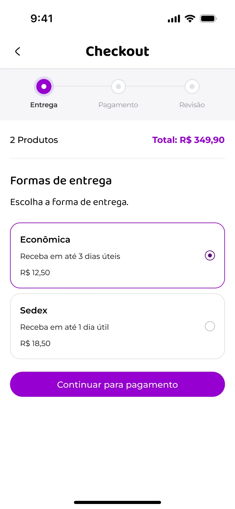
A reason to return, right beside the cart.
The points programme sits in the tab bar as "Meus pontos", one tap from the cart. Putting the reason to come back next to the reason to buy was deliberate, and it is the part of the app that still looks the way I drew it.
Entering the app
The product after launch.
Figures published by Wicomm in their 2025 case study, measured well after launch.
Where it stands
I designed this in 2021 and left Wicomm in 2023. The app has had changes since, so what is on the store today is mostly, though not entirely, the design in these screens. The numbers above were published after I left, which makes them a fair read on how the product held up rather than something I measured myself.