Sciene / Design System · 2025-2026
One system, three products.
The shared foundation behind Sciene's three B2B products. I built the tokens, the component library, the accessibility standards, and the docs, then worked with engineering to get them into production so new workflows could be assembled from parts we already had.
Tokens, components, accessibility & documentation · Built with engineering
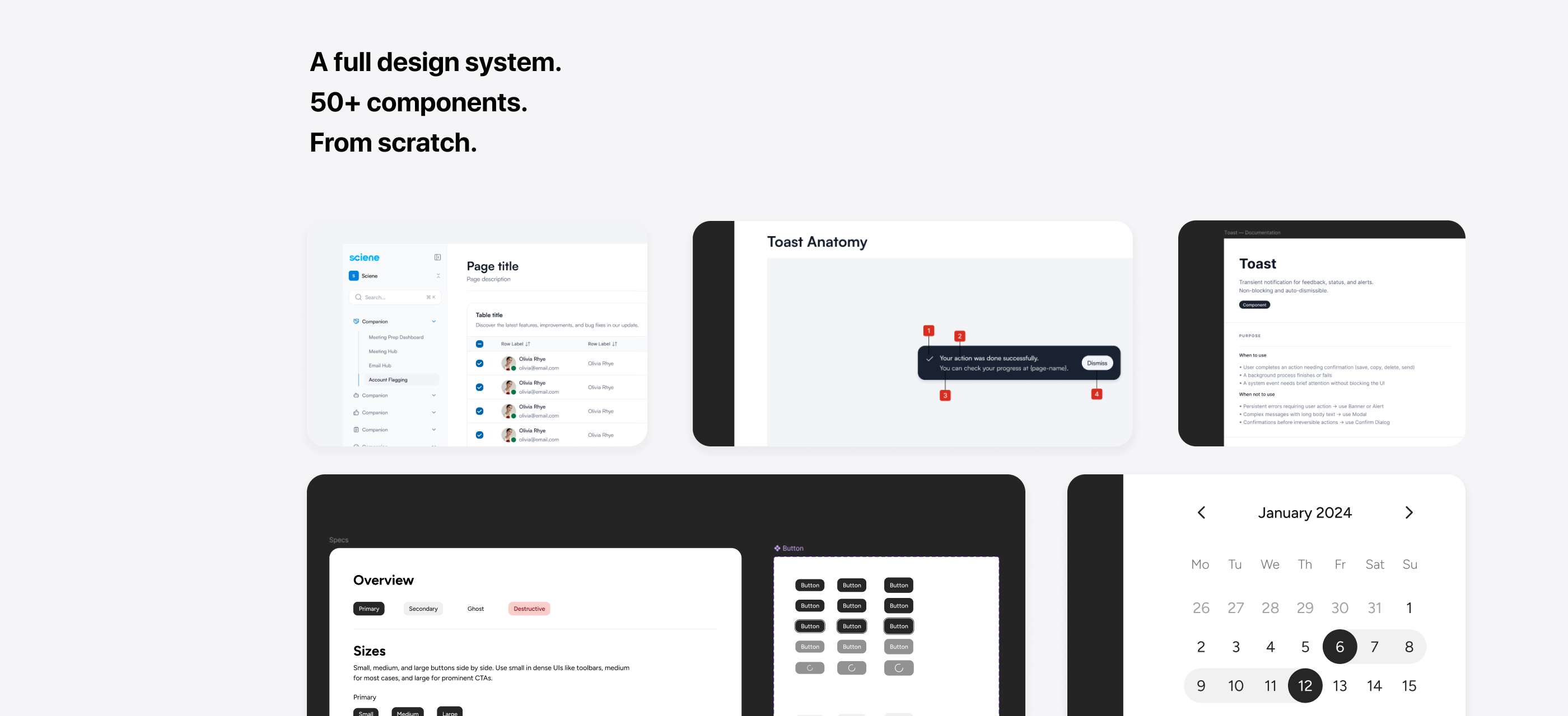
Three products repeating the same decisions.
Companion is Sciene's suite for Customer Success teams: Account Flagging, an AI Email Hub, and a Meeting Hub. I designed all three.
The problem was obvious in my first week, and it was not that the UI looked dated. Three products were being built on no shared foundation, so the same decision was getting made over and over, slightly differently each time.
Nobody had done anything wrong. There was just nothing to build against.
So the first thing I pushed for was not a redesign. I made the case to product and engineering that a system would pay for itself the moment we started the second module, and then I built it alongside v1 rather than stopping delivery to do it.
The audit
I went through the existing screens and marked every place the same idea had been solved twice. One screen from the Meeting Hub, with what I found on it.
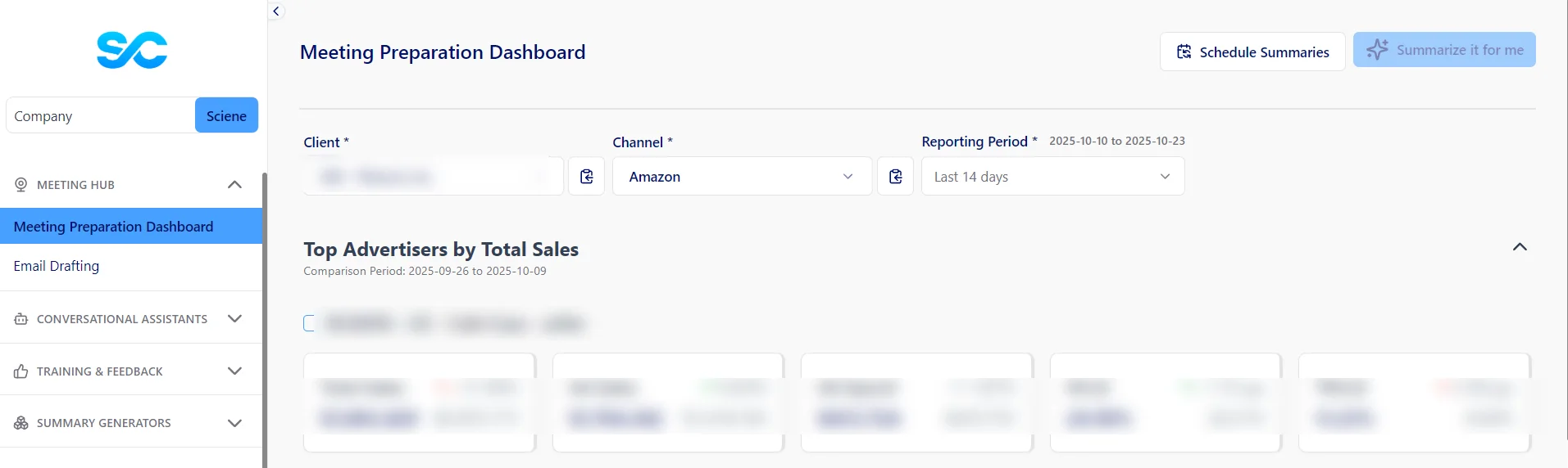
Client and revenue data blurred. The patterns are the point.
Change one rule. Update the system.
Each layer only knows about the one above it, so a change to a value moves through the whole product without anyone editing a screen.
- FoundationsColour ramp, type scale, spacing steps, radii. Decided once, argued about once.
- Semantic tokensRoles rather than values.
btn-primary-bg,btn-secondary-bg,bg-secondary, and the severity roles behind critical, warning, and healthy. - PrimitivesButton, input, select, checkbox, badge. No product knowledge in them at all.
- ComponentsThe alert row, the filter bar, the metric card. Primitives composed into things that know a little about the domain.
- PatternsTriage list, acknowledgement flow, empty and loading behaviour. The rules for how components sit together.
- ProductAccount Flagging, the AI Email Hub, the Meeting Hub. Assembled from the layers above, holding only what is genuinely specific to them.
- Raw value#f2f4f7
- Semantic role
btn-secondary-bg - PrimitiveSecondary button
- ProductSnooze, on an alert a CSM is triaging
Share the patterns. Keep the product specific.
The fastest way to kill a system is to put everything in it. Something got promoted when it met most of these, and stayed local when it did not.
Rules that make the interface predictable.
Severity gets decided once, in the tokens
Critical, warning, healthy. Those three states turn up in all three modules, so they became tokens with a fixed colour, icon, and weight. Nobody picks a red. When a CSM sees the same red in the Email Hub that they saw in Flagging, it means the same thing.
No outline buttons, and hover always fills
Outline buttons kept disappearing next to dense tables. They read as decoration, so secondary buttons got a filled surface. Same reasoning for hover: a colour-only change is easy to miss when you are scanning forty accounts, so every row and option fills.
Documentation written for two readers
The docs are for engineers and for the AI assistants everyone now has open. Semantic token names, component notes written as usage rules, states listed in a predictable order.
One component, different contexts.
The alert row is the piece the whole product leans on, so it is the one worth taking apart. Switch the states and the content to see what it has to absorb.
The system and the product
That one row carries the triage pattern into all three modules. Flagging lists it by severity, the Email Hub folds it into a digest, and the Director Dashboard aggregates it across a whole team.
The traffic runs both ways. Building the Director Dashboard surfaced something the row had not been asked to do: the same flag has to read differently depending on who is looking at it. When a CSM marks an account as needing help, that is an open request in their view and something waiting on them in the director's. One component, two audiences, and the requirement came out of the product rather than out of the system.
From a library to a product in production.
The engineers were already moving fast, so the system had to keep up with them. Figma variables mapped one to one with the tokens in code, which meant changing a value was changing it once. I sat with them while they built the first few components, and after that they mostly did not need me. Handoff docs got written next to the design work, while the reasoning was still fresh.
Changes went through a light review with whoever owned the affected code, and the rules that came out of those conversations went into a short process doc so the next person did not have to relitigate them.
The test I actually cared about: could someone build a screen I had never drawn and have it still look like Companion? By v2 that was true, and it is the reason the Director Dashboard took days instead of weeks.
The rules, running in the browser.
The primitives underneath all of the above, running. Tab through them to see focus behaviour, type into the input to trigger validation, and open the select with the keyboard.
Accessibility, at the component level
Solving this once in the primitives was most of the argument for having a system at all. Severity never rides on colour alone, so every status carries a text label and a shape. Focus is a visible ring rather than a colour shift, every control is reachable and operable from the keyboard, and the select in the demo below takes arrow keys, Enter, and Escape. Contrast targets were set in the foundations, so components inherit passing pairs rather than each screen checking its own.
Designed against WCAG standards and checked with contrast tooling. I have not validated it with screen readers, so I would not claim that.
Rebuilt in this site's code from the original rules. The production library lives in Sciene's codebase.
Documentation for people and AI assistants
Semantic token names and usage rules turn out to matter more once an assistant is in the loop. A model asked for an alert row picks the right primitive when the docs say what a token means, and picks a plausible wrong one when they only say what colour it is. Writing for that reader turned out to make the docs better for new engineers too, since both need the same thing: the rule, not the hex value.
It also takes the repetitive half of the work. Code prototypes let me test how a component behaves in a browser before committing to it, and a first pass of documentation gets drafted rather than typed. I still make the calls and check the output.
The next module proved the system.
The Director Dashboard that shipped in v2 was assembled from parts that already existed. No new screens to design from scratch, which is what I had argued the system would buy us.
What I would do differently
I over-componentized early. Things that looked like patterns after appearing twice turned out to be coincidences, and I had to collapse a few components back into the screens they came from. Waiting for the third use before promoting anything would have saved me that work, and the criteria above are what I ended up with because of it.