Traktive / Product Design · 2024
One yard. One shared view.
Traktive is a B2B platform for rail operations, built around showing owners where money leaks out of the daily run of the yard. I led discovery and design from zero to a launch-ready prototype.
Discovery to a launch-ready prototype
Usability testing with 10 operators · Spatial view compared with a table
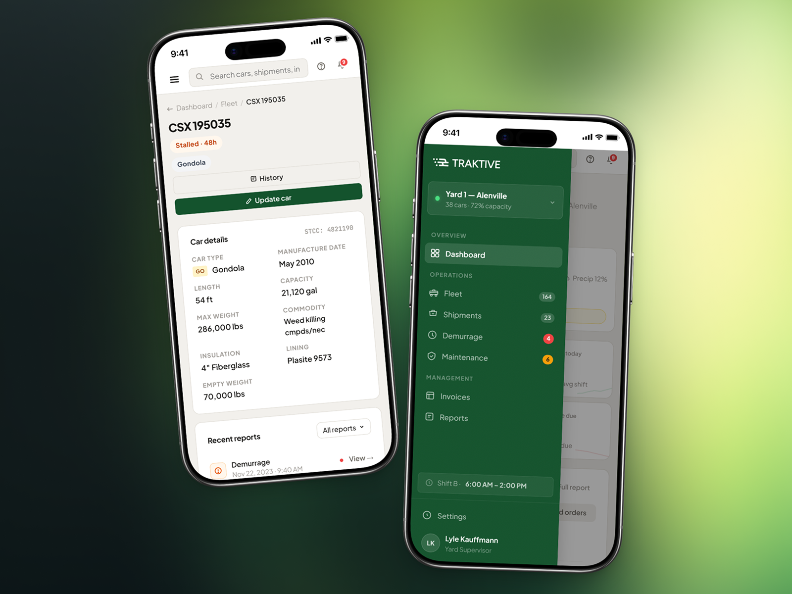
The work was scattered across tools.
Rail yards run on workflows that rarely talk to each other. Data sits in separate systems, and nobody can see the current state of the yard without asking someone. Traktive set out to put all of it in one place so operators could act on what was actually happening.
Operators were stitching together insights from disconnected legacy systems, spreadsheets, and phone calls, losing hours every day to manual coordination that the platform should handle automatically.
Fragmented data across disconnected systems
Lack of tailored software created data bottlenecks and fragmented access across teams and locations.
No real-time visibility into operations
Legacy systems could not show the yard's current state in one view, so decisions were made on stale information.
Time-consuming manual processes
Manual steps invited mistakes, and the mistakes cost both money and hours to unpick.
Inefficient asset tracking and record keeping
Records and asset tracking were scattered across tools, so nobody could say with confidence where the fleet was.
Operators pictured the yard as a space.
I conducted user interviews with business owners, operators, and logistics coordinators to understand who the users are, how they work, and what challenges they face daily. Three patterns emerged.
Operators needed one place that replaced the others
Every operator we spoke to was already using three to five different systems. They didn't want a new dashboard on top of the pile. They wanted one place that replaced the stack entirely.
Cost visibility was reactive, never proactive
Business owners only discovered cost overruns after the fact, buried in monthly reports. They needed real-time cost tracking tied directly to operational events, so they could course-correct before small inefficiencies became expensive problems.
Operators picture the yard as a space
Operators thought about their rail yards as physical spaces with assets moving through them. Any solution had to reflect that spatial awareness, showing where things are and where they need to go.
Visibility first. Cost intelligence next.
The insights made the sequence clear: start with the operator's mental model of the yard as a space, build real-time visibility first, then layer in cost intelligence and decision-support tools.
Discovery and execution details
Discovery
- User interviews with rail operators, business owners, and logistics coordinators
- Competitor analysis across rail logistics and fleet management platforms
- Mapped existing workflows to identify friction points and redundancies
- Requirements gathering and pain point prioritization with stakeholders
Execution
- Low-fidelity wireframes to validate information architecture with users
- High-fidelity prototypes built around spatial awareness and real-time data
- Usability testing sessions with operators to validate core workflows
- Iterative refinement based on testing feedback before handoff
Giving operators a real-time spatial view of their yard
01 / Operational Dashboard
The problem
Operators had no way to see the current state of their rail yard at a glance. They relied on radio calls, physical walk-throughs, and outdated spreadsheets to know where assets were. By the time they had a picture, it was already stale.
What I explored
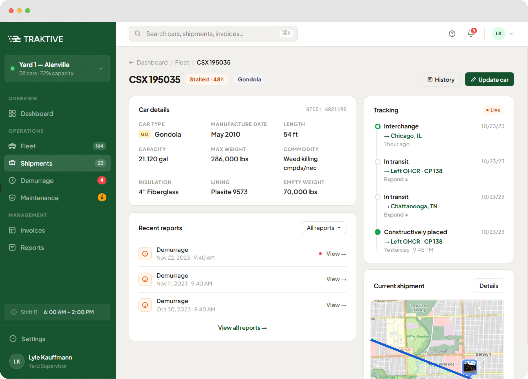
The first iteration was a traditional table-based dashboard listing all assets with status columns. Testing showed operators constantly re-mapping table data to their mental image of the yard. The second iteration introduced a map-based view with asset overlays. Operators immediately responded: "This is how I actually think about it." The final design combined a spatial yard map with a filterable sidebar for detailed asset data.
Why this direction won
In usability testing with 10 operators, participants located and assessed assets roughly 4× faster using the spatial view than the table view. The hybrid approach (map + sidebar) gave power users the detail they needed without forcing everyone through a spreadsheet-first experience.
Turning reactive cost reports into proactive alerts
02 / Cost Intelligence
The problem
Cost overruns were discovered weeks after they happened, buried in monthly financial reports. Business owners had no way to connect operational decisions to their financial impact in real time. By the time they saw the numbers, the damage was done.
What I explored
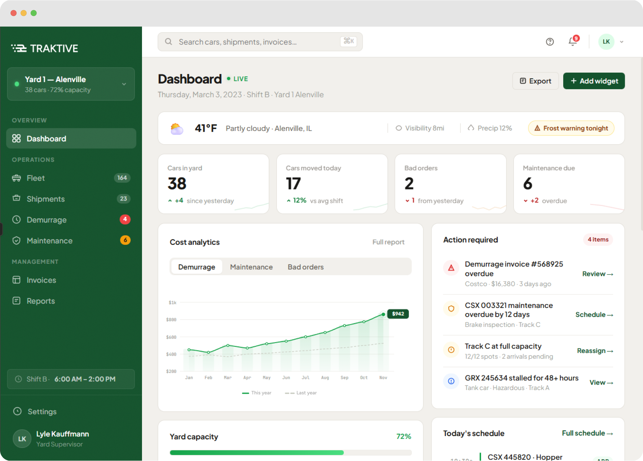
I tested three approaches: (1) a financial dashboard with charts and historical trends, (2) inline cost annotations on operational views, and (3) proactive alert cards that surfaced when costs deviated from expected patterns. The standalone dashboard felt disconnected from daily work. Inline annotations added noise to the spatial view. Alert cards, shown contextually in the operator's workflow, struck the right balance.
The trade-off
Alert-based cost intelligence required establishing baseline cost models for each operation type, which meant a longer onboarding period. I designed a guided setup flow that learned from historical data during the first two weeks, so the system could start surfacing meaningful alerts without requiring operators to manually configure thresholds.
Replacing five disconnected systems with one unified view
03 / Data Consolidation
How I made the case
Through workflow mapping, I documented that operators were switching between 3-5 systems for a single task: checking asset status in one tool, updating records in another, communicating via radio, and logging costs in a spreadsheet. From that mapping I built a time-cost estimate, around 2.5 hours per operator per day lost to system-switching, and used it to make the prioritization case to stakeholders.
The outcome
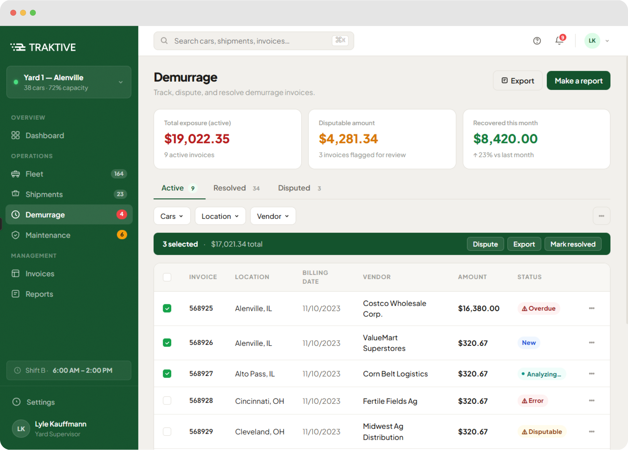
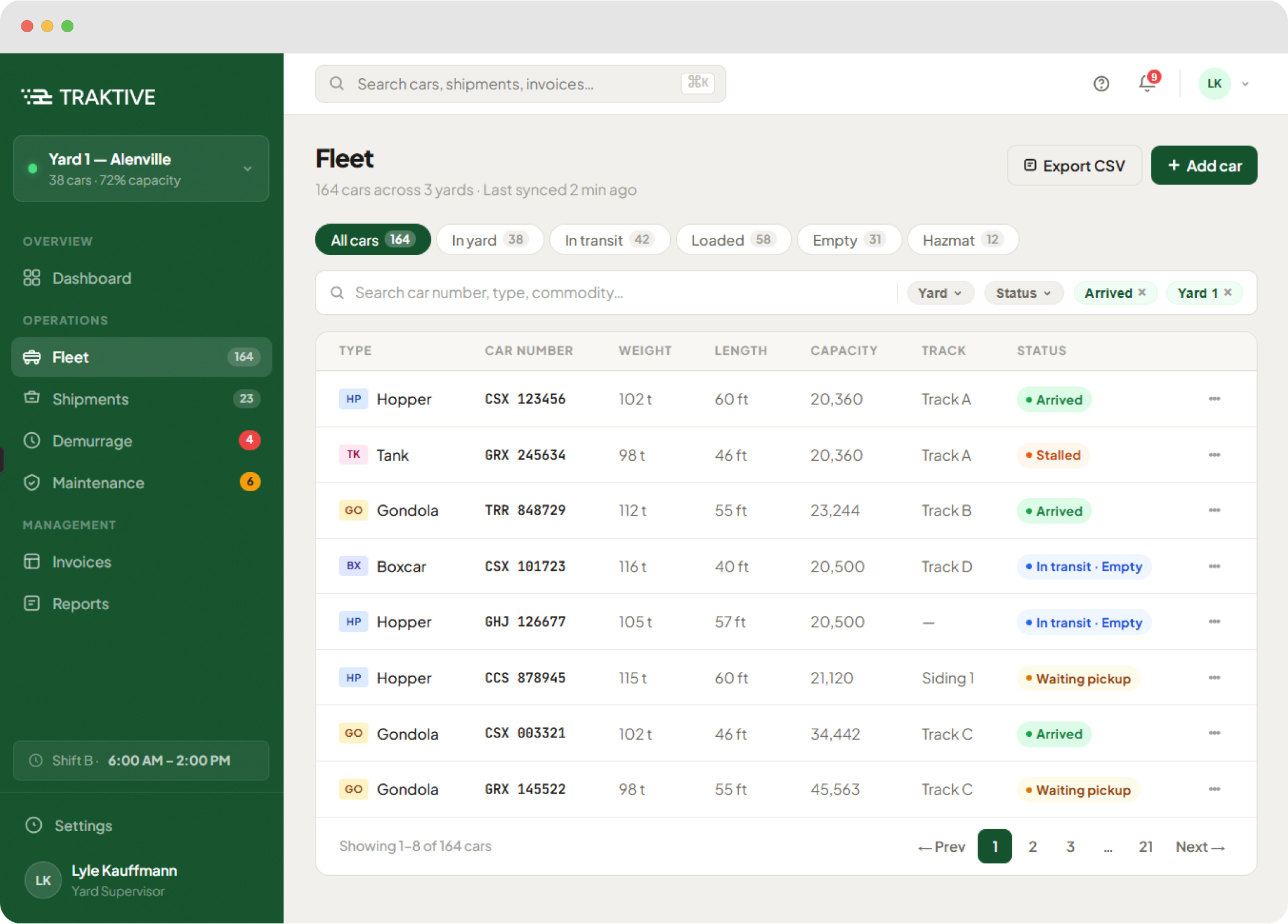
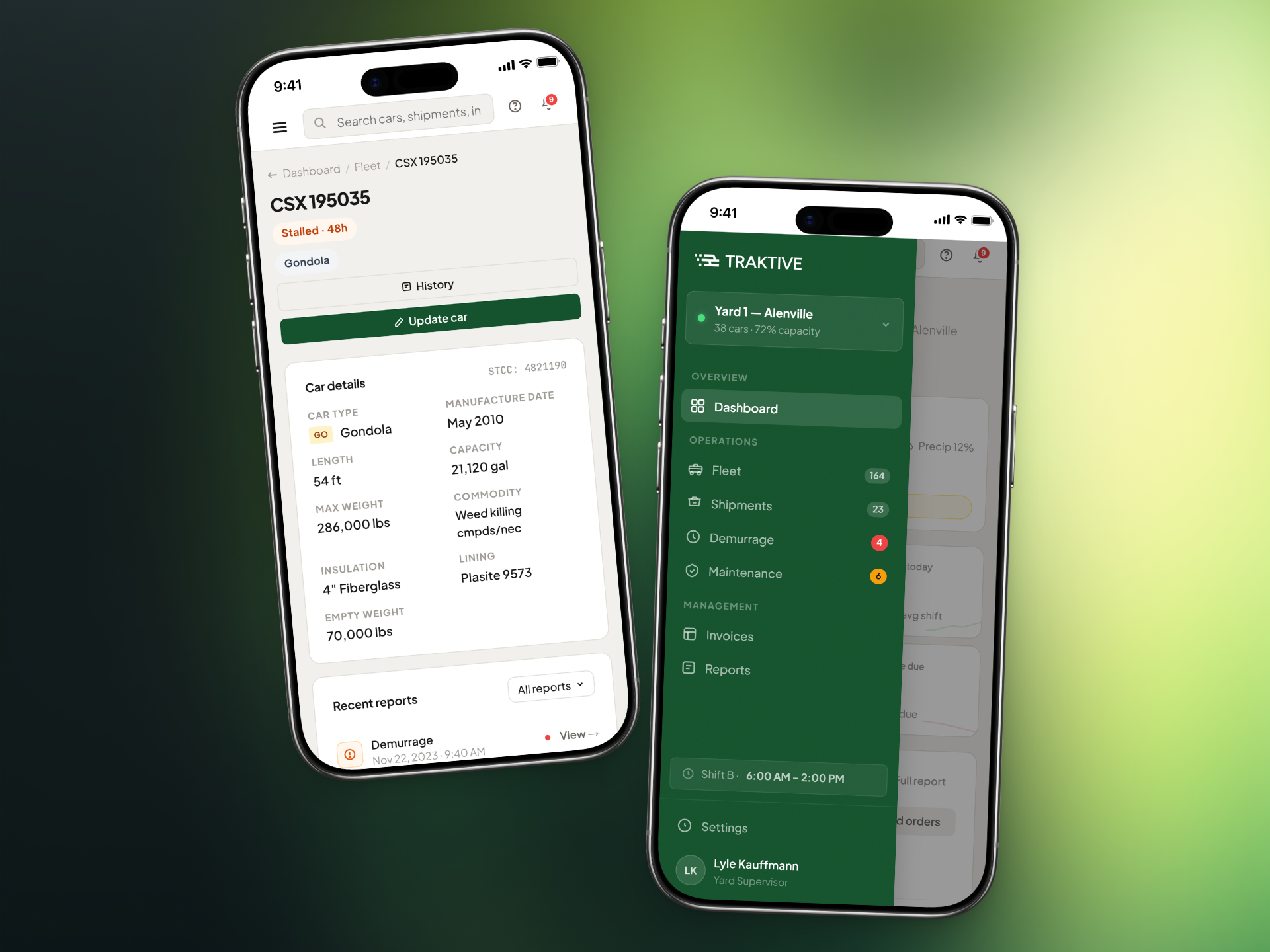
The consolidated platform brought asset tracking, operational planning, cost monitoring, and communication into a single interface. In prototype testing, operators completed end-to-end workflows (receiving a shipment, assigning yard space, updating records, and flagging costs) without leaving the platform. A workflow that previously spanned four tools completed inside the platform in under two minutes.
What prototype testing showed.
The consolidated platform brought asset tracking, operational planning, cost monitoring, and communication into a single interface. In prototype testing, operators completed end-to-end workflows (receiving a shipment, assigning yard space, updating records, and flagging costs) without leaving the platform. A workflow that previously spanned four tools completed inside the platform in under two minutes.
Learn the domain before drawing the solution.
Designing for rail logistics meant entering a domain I had no prior experience in. The most useful thing I did was resist the urge to start drawing screens and spend the first weeks working out how operators actually think about their yards. Finding out they picture the yard as a space is what set the shape of the product.
Building a 0-to-1 product also meant making constant scope trade-offs. Every feature had to justify its place in the first release. I learned to frame these conversations around user evidence, presenting test results and workflow data to help the team prioritize what would ship first versus what could wait.